
Improve rewards for members
The challenge
When I joined H&M in 2018, a big overhaul of the H&M loyalty program was underway, aiming to increase engagement and member satisfaction, decrease calls to customer service, and grow the membership base.
My role
UX Designer, working on several "cases" with different teams (Business Solution Analysts, IT Architects, UI Designers, etc.). I worked on making it easier to use rewards, offering new benefits (like payment with Klarna) and ways to earn points.
Outcomes
Conversations with Customers Service about the membership decreased thanks to our efforts to improve usability (in the first month after launch: 7% of all contacts, down from 10%. Over time, membership dropped out off the top 10 main reasons for contacts completely).
+21% of members use rewards every time they shop or every other time, as we made it possible to apply rewards easily at different stages in users' journeys.
On mobile, about half of customers use the Klarna payment methods we introduced, and it drove up conversions.
The process
We were working in a waterfall environment, and when I joined H&M, discovery, requirements and analysis had already been completed.
Below are two examples of cases I worked on.
Rewards
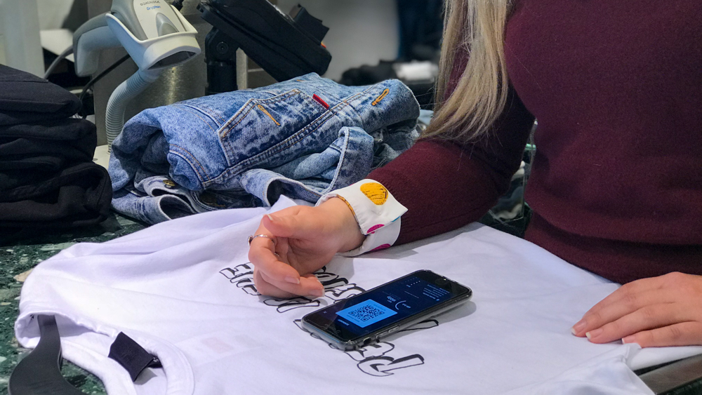
The problem: "Okay... How do I use this?"
Usage of rewards was low. Previous research had shown that:
- users had no idea how to use their offers online,
- staff was spending a lot of time helping customers with rewards in stores.
Design, test, iterate
- The Rewards page was a big source of confusion and frustration for users: it had a button to use the offer in store, but just text about how to use it online. I tested having a button to use in store, but participants were unsure what to expect when clicking the new button. I had to tweak the copy and the design of the confirmation message several times.
- Error messages: I mapped out error cases with Analyst and Architects. We realised there were more technical limitations and complex business rules than expected: offers that cannot be combined, maximum discount reached, etc. Providing precise error messages, like I had planned, would have impacted load times too much in the shopping bag. To balance that out, I made sure the process was forgiving (offers can be used again if they did not result in discounts).
- In store experience: Technical limitations kept piling up when we were exploring how to provide an easier experience in store. At some point, we had to acknowledge that we had scoped out so much of our solution that it was not solving any of users' problems anymore. So we made the decision to leave this out of the release. But we knew the systems would change soon, so that in the near future we could give it another go!
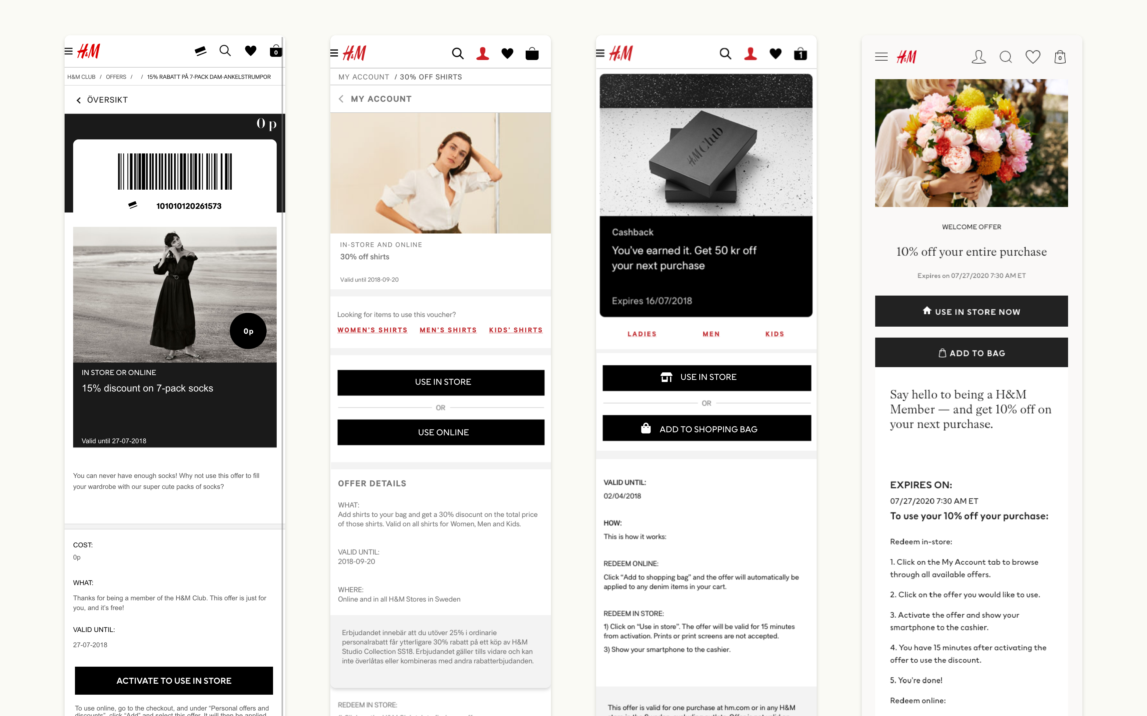
The main changes were: An added button to use the offer online, moving up the buttons and changing copy, removing unnecessary information (bar code, breadcrumbs, etc.).
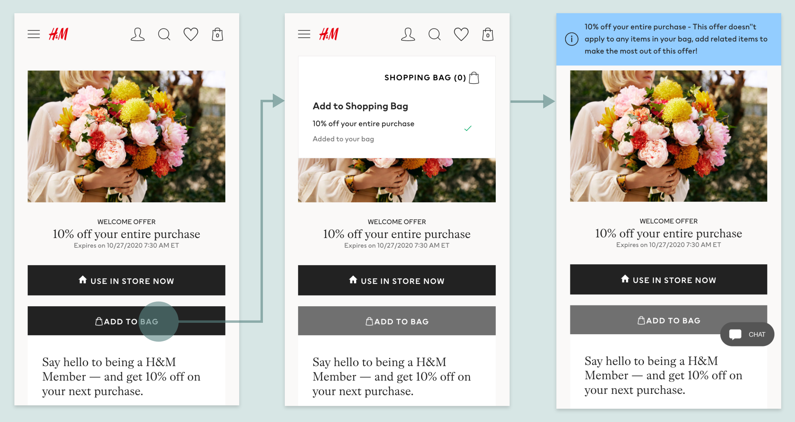
Using the same component as when adding clothes to the bag made it clearer what had happened than other types of messages I tested.
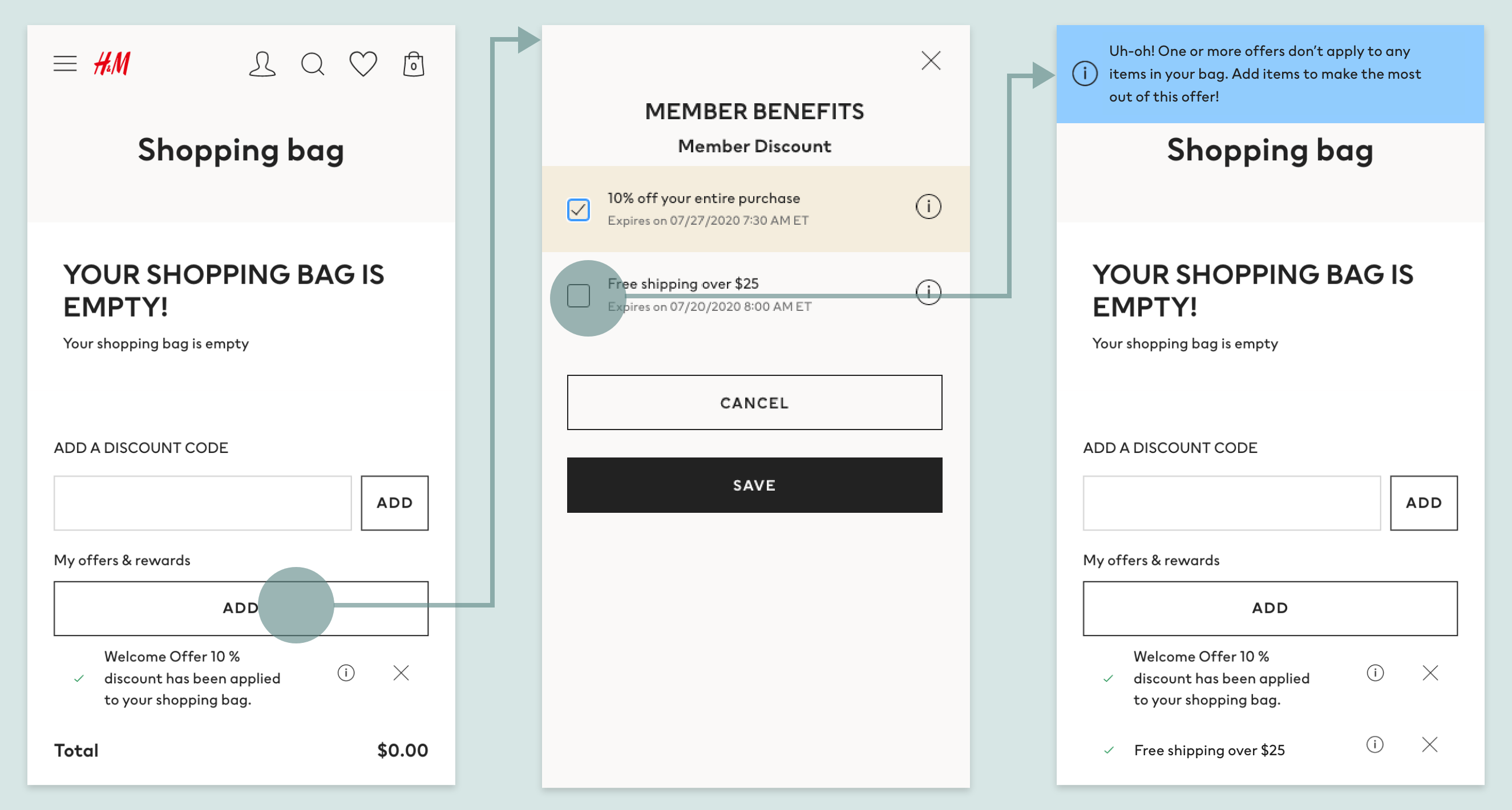
Monthly invoices
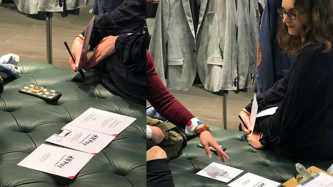
The brief from business stakeholders
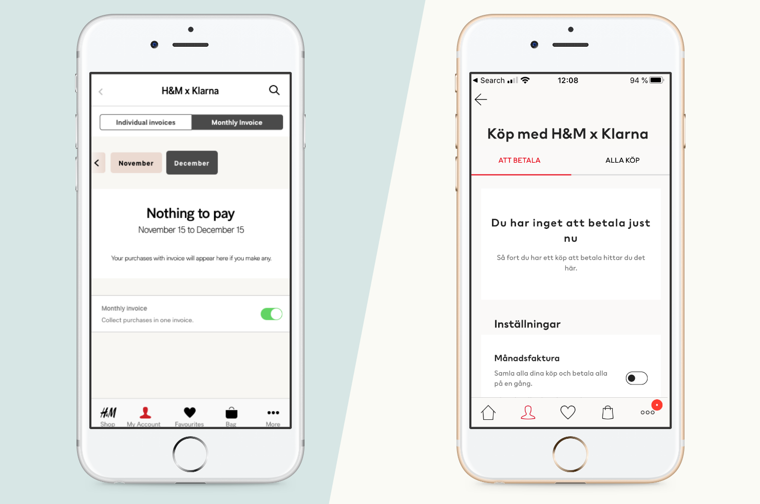
H&M wanted to introduce a new benefit for members: monthly invoices with Klarna. My job was to find how to make that fit into the existing Pay later section under My Account, and to provide helpful reminders when time came to pay the invoices.
Design, test, iterate
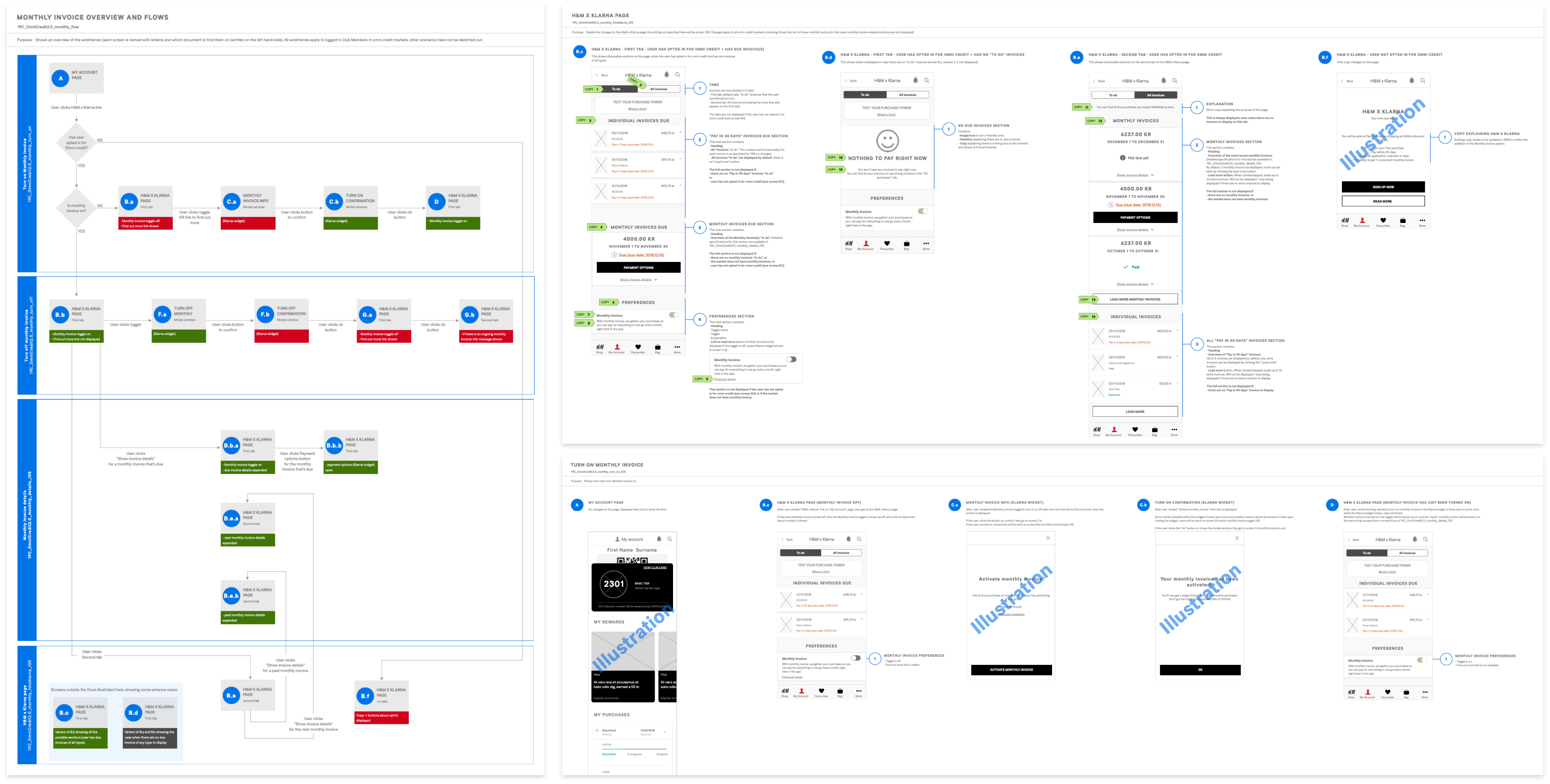
- Finding and paying invoices: The biggest challenge was to fit everything into one page. My first idea was to provide two tabs: one for Pay in XX days, and the other one for Monthly invoices. But it became clear in user testing that the distinction between the two methods was irrelevant to users. What matters: what still needs to be paid, and what has already been paid.
- Notifications: To encourage customers to pay in time, from the H&M app (not from the Klarna app), it had been decided that we would send push notifications about due invoices. The problem? H&M already sent a lot of notifications! I tried to push to send less notifications overall, and to allow users to choose what types of messages to opt-in for. But I did not manage to get all stakeholders to agree in time for that release. We did however launch a wider initiative around the quality and quantity of our communications to customers. And for that release, I focused on highlighting things to pay within the interface instead, for instance through badges and an inbox for personal communications in My Account.

Wrapping up
The results of the Loyalty program re-design were overall positive, but there were a few missed opportunities. For instance, focus during the re-design was on making things easier for members themselves, but we failed to address the needs of staff working on the Loyalty program in different markets. As a result, they use workarounds: for instance, they put up announcements about the Loyalty program on site by using the Rewards page template. So, in some countries, the Rewards section contains more news than offers, and the perceived relevance of rewards has gone down.
<< See other examples of work