
Improve the Hotel Details page
The challenge
Improve the Accommodation pages of the Thomas Cook website, which contain detailed information about the hotel, possible flights and board options.
The goal? Increase progression to the next step of the booking journey and decrease contacts to Customer Service.
My role
UX Researcher, working within a Product team in charge of the Accommodation page.
Outcomes
A complete re-organisation of the content on the page, and some minor design changes, which we gradually rolled out to measure effects. For instance:
- Changes around Room Details and Board Type led to an increase of 3.5% in conversions.
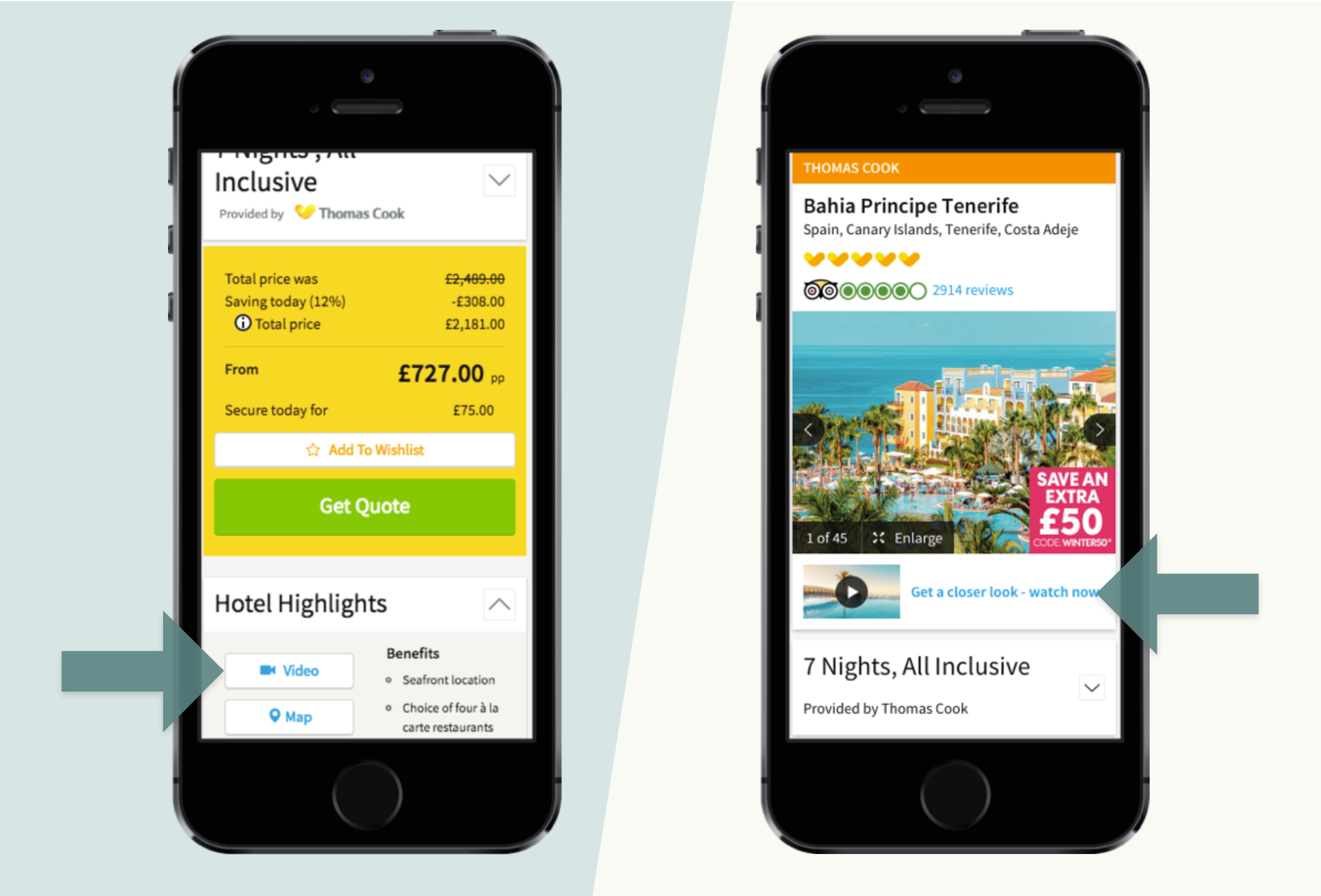
- The new location and design for videos led to an increase of 349% in engagement with that content (and interacting with the video has the highest associated conversion rate of all clickable elements on the page).
The process
Understand the problem
Research questions
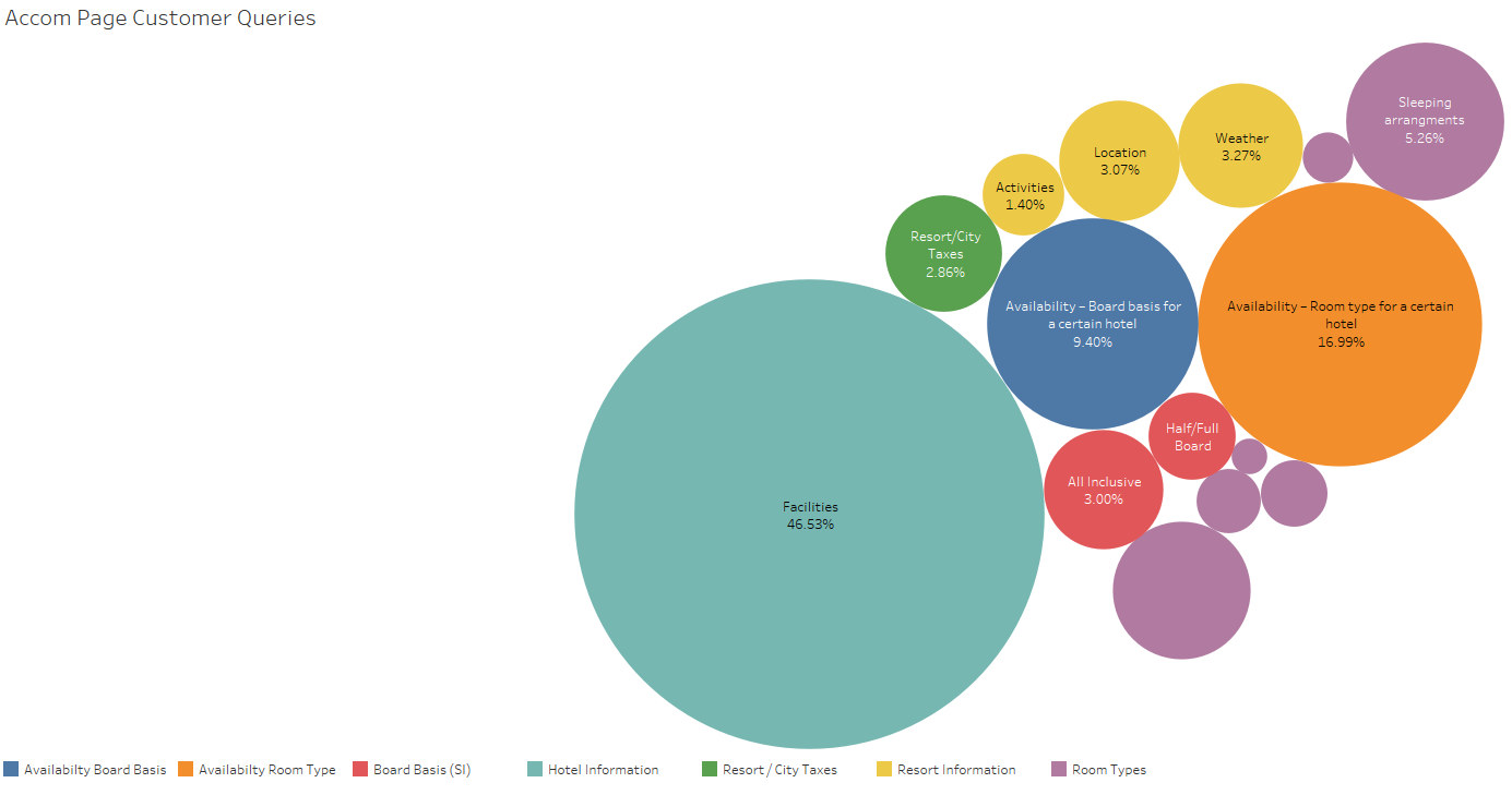
- Why do we have so many contacts to customer service about this page?
- What information are users missing to make their decision?
Methodologies
- Review quantitative data from customer service and Hotjar to identify issues,
- Remote unmoderated usability testing on Usertesting.com to dig deeper into why some issues occurred.
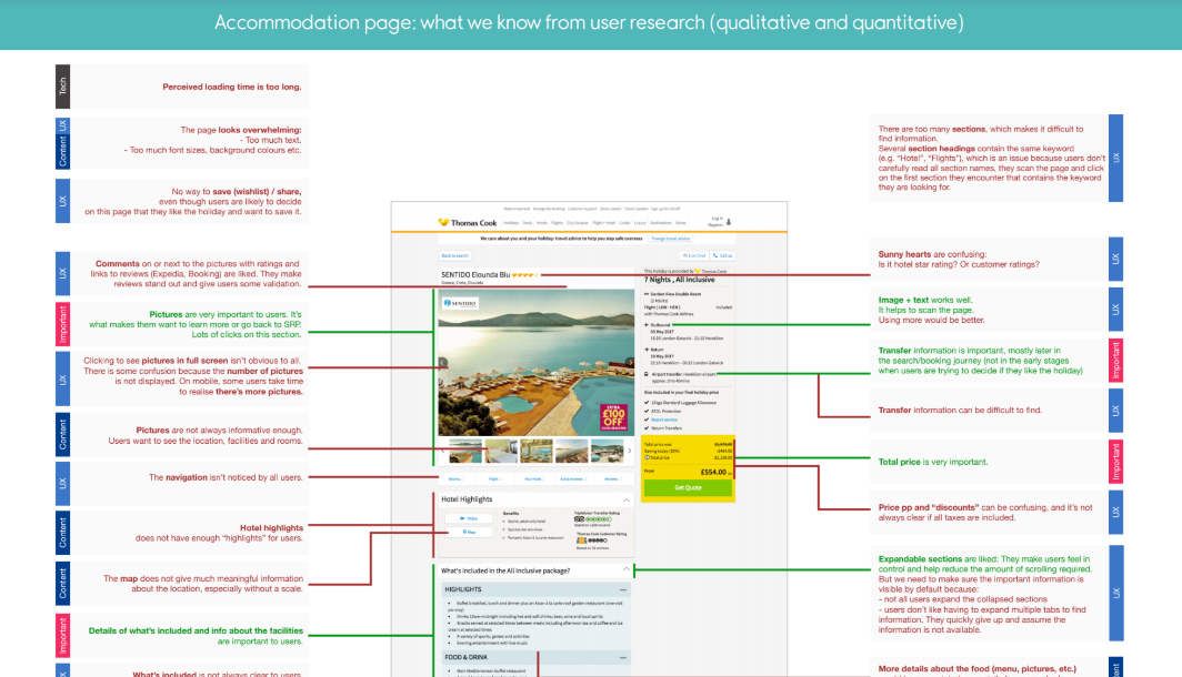
Main findings
- some buttons were hard to discover.
- some content wasn't where users expected it to be.
- it was hard to know what content to expect in a section based on its name.
- the structure was too deep: after expanding a few subsections without finding what they were looking for, users just gave up.
Workshop
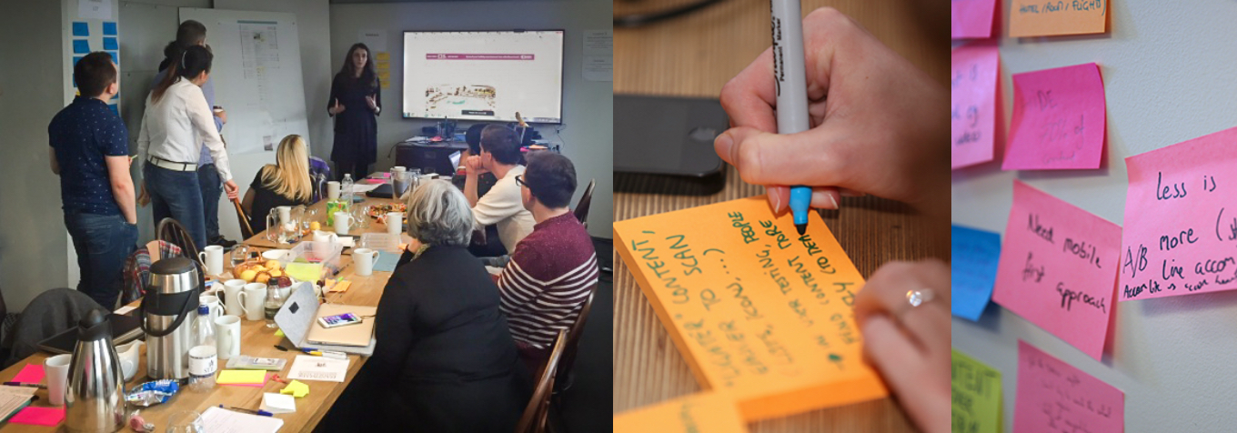
A workshop was led by the Product Owner and Design Lead. I presented an overview of all the issues encountered on the Accommodation page. The outcome? A prioritised list of opportunities to act on, starting with re-organising the content of the page, and increasing affordance for key features.
Propose a new structure
Card Sorting
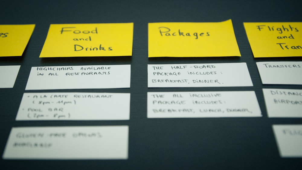
I organised a card sorting exercise on Optimal Workshop to find out how users naturally group the content and name the sections.
Results
A couple of sections of the page weren't groups users naturally thought of, and users chose section names that are more descriptive and shorter than the existing ones.
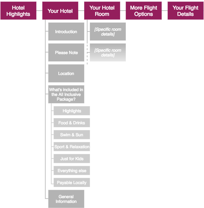
I presented these results to the team. There were surprises, but we managed to agree on a new structure to test. Some of our proposed changes:- Remove the Your Hotel section, which had subsections about activities and food.
- Merge some sections (for instance: More Flights Options + Your Flight Details = Flights & Transfers, or Just for Kids + Sports and Relaxation + Everything else = Activities).
- Shorter, more descriptive names for some sections, like Pool & Beach instead of Swim & Sun, or Packages instead of What's included in the packages?

Validate
Tree Testing
To validate our proposition, I set up tree tests on Optimal Workshop, with tasks based on the most frequently asked questions to customer service. There were some concerns in other markets: they felt some things would only work in English. So I got help from colleagues there to set up similar tests in German, French and Dutch.
Results
We saw increased success rate, less hesitation and lower completion times for most tasks. But there were a few things to fine tune. For instance, a section about the location of the hotel was added (instead of having that information in Hotel Highlights). I organised a new test to validate this new proposition.
Re-design and test
In some cases, we also needed design changes, so I discussed possible solutions with the designer and developers, and then tested them with users.
Wrapping up
In addition to having positive effects on conversion, our work helped to foster collaboration with copywriters and colleagues in other markets.
<< See other examples of work