
Increase sign ups
The challenge
15% of H&M online customers are not members of the loyalty program. How might we encourage them to sign up?
My role
Product Designer in a new Team in charge of increasing the number of sign ups.
Outcomes
Reduced drop outs (-10%) and reduced time to join (-25s) thanks to usability improvements in the sign up form on mobile.
Increased sign ups in the checkout after A/B tests around the copy.
Launched membership in South Korea with Sign up through the popular KakaoTalk App, which helped to reach a big milestone: 100 million members.
The process
We were bombarded with requests to add features, or put the sign up button in more places. But there was little data to back that up! So, I started by conducting research to inform our decisions.
Research
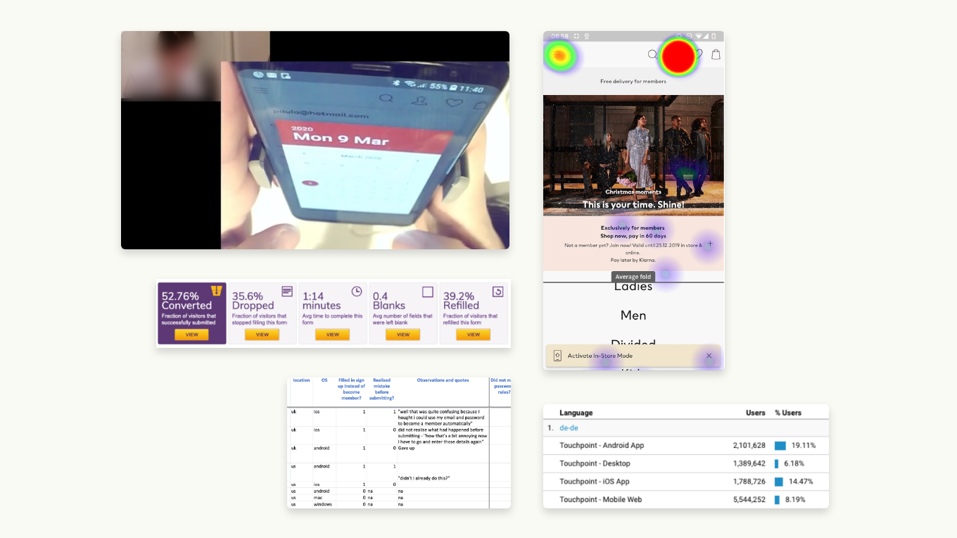
Main Research Questions
- Are there issues stopping users from signing up?
- Can users find where to sign up? Are we promoting sign up right?
- Are there market specificities we should be aware of?
Methodologies used
- Click tests on Userzoom.
- Usability testing.
- Previous in-house research into local experiences.
- Quantitative data from Google Analytics and Clicktale.
Key takeaways
- In what context we promote sign up and which benefits we put forward needs some work. We don't need to put Sign ups CTAs everywhere, users can find it already, and it's getting a bit too much. But, we are not doing enough at the checkout, and the copy tends to be uninspiring.
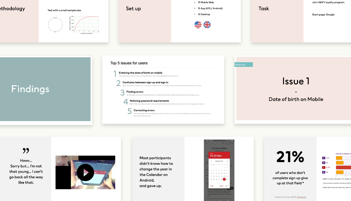
- The drop out rate on mobile is 30% higher than on desktop: no wonder, when it takes 40s longer to sign up, and there's severe usability issues on Android.
- More sign-up options is a must, especially in some key markets.
Based on those insights, we established our priority. Then, I did a quick showcase of the research at our Sprint Demo to help our stakeholders understand the decisions.
Reduce friction
The problem
The date of birth was by far the biggest drop off point in the sign up form.
How might we solve it?
- Stop to require the date of birth: The Product Owner and I started discussions with key stakeholders: Why do we need the date of birth? How else can we collect it? I prototyped a few ideas to help kickstart things.
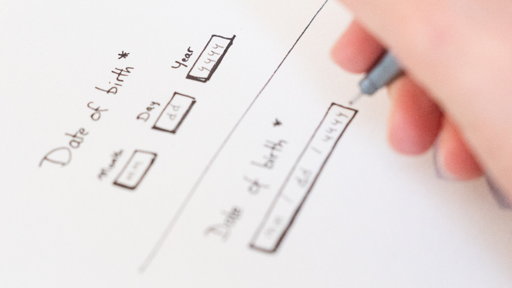
- Change the input method: with a precise date so far back in the past, a calendar (Android) or a scrollable list (iOS) are not the most appropriate. I reviewed existing research and guidelines (like Research by gov.uk and Material Design) and sketched out two ideas.
Feeback in Design Review helped me to pick the solution that allowed to stick to existing components in our Design System: three simple input fields, with one visible label.
Results
Drop outs and time to complete the form decreased. And the rate of errors when filling in the form did not significantly change like we could have feared.
Focus on checkout
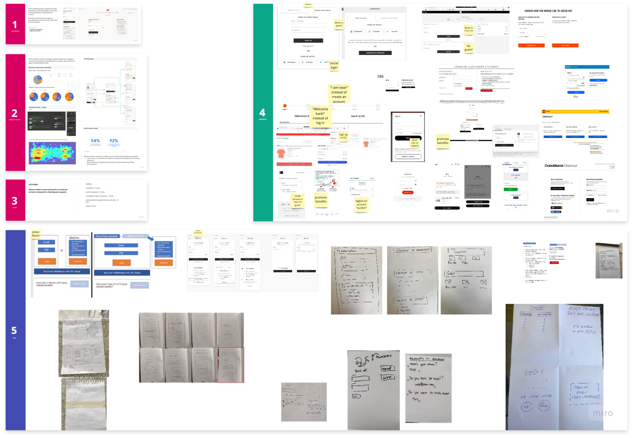
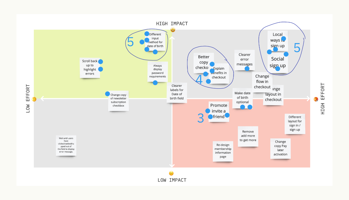
Review the data and our goal (1, 2, 3), look for inspiration (4), Crazy eights (5).
Opportunity
Promoting sign up in the checkout is where it makes the most sense for users: they get immediate benefits from it (like free shipping and discounts). And user testing pointed to some easy improvements, like tweaking the copy.
Ideation Workshop
I invited business experts, designers, product owners and analysts from Loyalty and Checkout teams to a workshop to generate ideas together. The workshop was very appreciated, as it brought together people who were not often in the same room, or didn’t feel involved in design decisions.
Outcomes
We generated a prioritised list of ideas to A/B test.
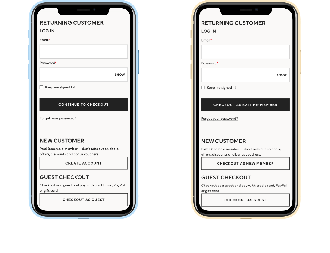
Locally adapted
Opportunity
The membership was about to launch in Korea, where email usage is low, and most people are users of the social media platform KakaoTalk.
Competitive analysis
I did some reading to understand the market better, and got help from local colleagues to examine how competitors tied their loyalty programs to Kakao.
User flows & new layout
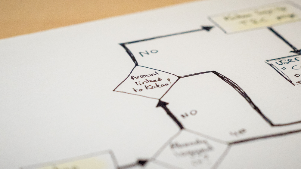
I worked closely with our IT Architect and Developers to draw up user flows. There were a lot of scenarios to account for, and it was a real challenge to keep the experience frictionless within the limits of our own systems and Kakao's Login API.
I sketched out the main flows and different layout possibilities for the sign up form. I selected 3 based on feedback in Design Review, then prepared prototypes to test.
Usability Testing
One layout resulted in less errors than the others. However, no clear insights emerged around some of the tricky points in the journey, like signing up directly from the Kakao App, or merging accounts if the email address is already in our systems. But it was expected: to gain time and reduce costs, I had to compromise in recruitment, and participants were Kakao users based in the US.
This is where my involvement stops: I unexpectedly had to join another product team.
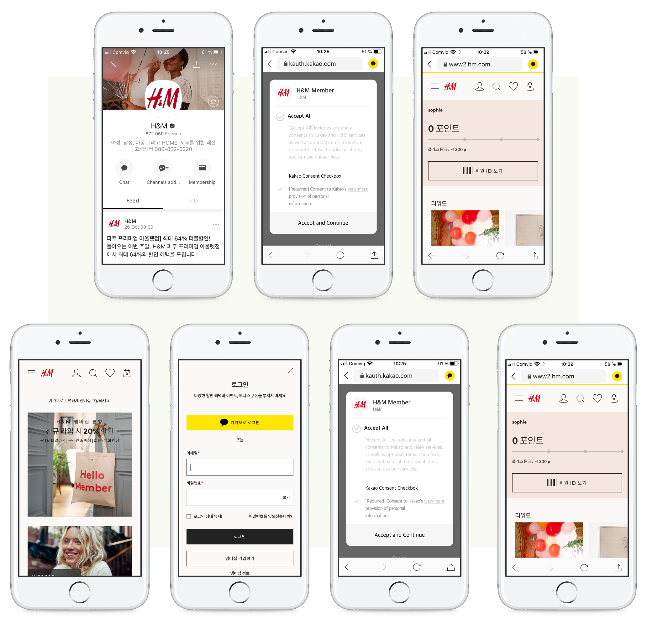
Wraping up
After 4 months in the team, I was asked to go help out another team. I handed over the work to another designer. When I left, the team thanked me for helping them to become more user-centered, more data-driven, and more confident in prioritising their backlog and handling stakeholders.
<< See other examples of work