Provide support to benefits claimants
The challenge
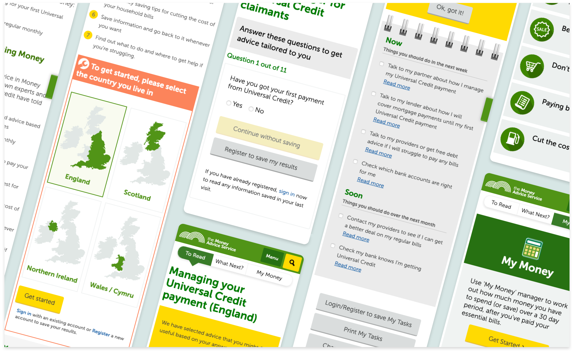
The Money Advice Service was commissioned by the UK Department for Work and Pensions (DWP) to build a tool offering financial advice to people claiming the new Universal Credit benefits.
The original idea of an online course about how to manage money was not well received: it did not answer users' main questions, and was perceived as kind of insulting. So, Money Advice Service decided to start from scratch. With only two months left before the agreed launch date and no available UX designers, they brought me in (as a UX Consultant from System Concepts).
My role
I was in charge of the UX Design and UI Design (based on the existing Design System).
I worked closely with a Project Manager and a Copywriter from the Money Advice Service, a Researcher and senior representatives of the DWP, and Developers from the agency in charge of building the website.
Outcomes
We launched an MVP that answers user needs and meets the expectations of the DWP. It is not the online course they originally commissioned, but it provides the support needed, in the right tone so the advice is well received.
The process
Understand users
User Interviews
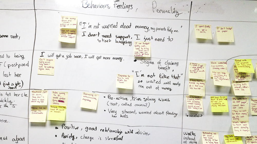
We needed to gain a better understanding of our target audience. I joined our Researcher as a note taker, while he conducted interviews at Job Centres. We focused on uncovering how our users managed their money and what their pain points were with the new Universal Credit benefits system.
Workshops
I held a series of workshops to collectively digest the findings from the interviews and define user needs, personas and user journeys. People had many negative assumptions about our users, and it was tough to get them to empathise. So the researcher and I had to work hard on making the stories we brought back from the interviews relatable, by including lots of details.
We often got trapped in discussions related to the "old" prototype that people were very attached to. Some of those discussion could easily be parked. But at other times, it was necessary for me to deviate from my perfectly-planned workshop agenda, talk things through and come up with different exercises on the spot to get us back on track to our end goal.
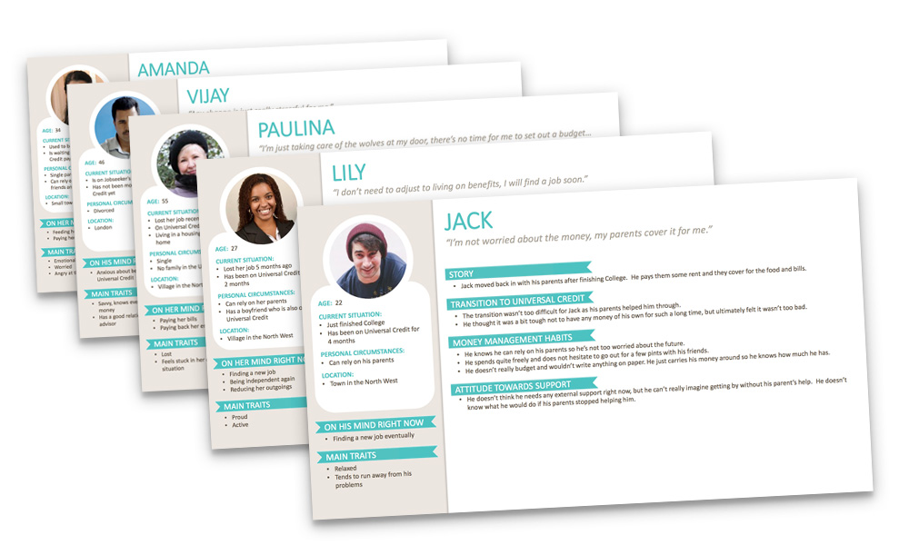
Personas, User Needs & User Journeys
Based on outcomes from the workshops, I finalised a list of user needs, personas and user journeys. Having these materials was useful later on to inform the design and the content creation.
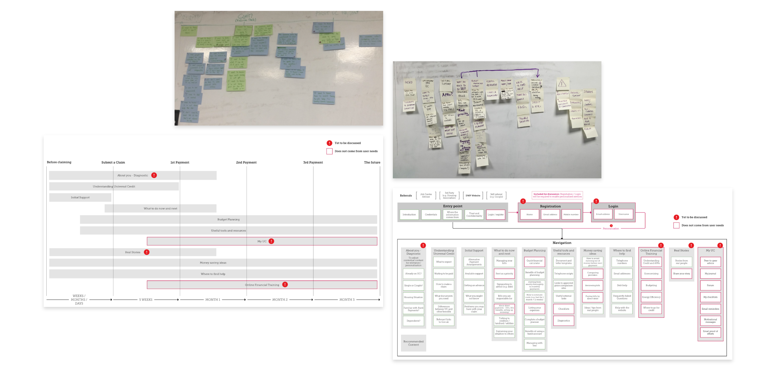
Based on the needs, we outlined what content was needed on site at each stage of the Universal Credit journey, and drew up a draft IA. Extra content was requested from senior stakeholders at the DWP (this is identified in a different colour in the deliverables, to help us remember it doesn't come from research and has to be validated.)
Design
Low-fidelity prototype & Guerrilla testing
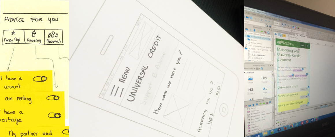
Based on the insights from the discovery phase, I produced sketches, and then low-fidelity wireframes in Axure. These were regularly shared with stakeholders, taken out for guerrilla testing and updated.
Work on the content
In parallel, I was heavily involved in reviewing the copy produced for the different sections of the site. The copy was tested with red and green pen exercises in Job Centers.
High-fidelity prototype & In-lab testing
When copy was ready and we were satisfied that the design was going in the right direction, I created a higher fidelity prototype for longer testing sessions in the lab.
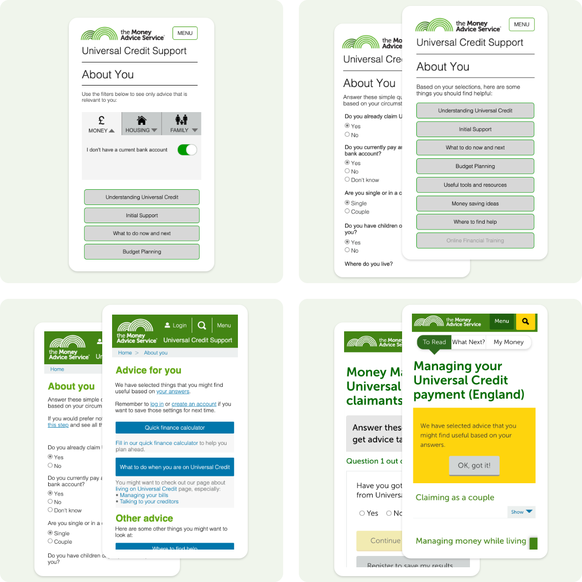
It then turned into a one-page questionnaire that felt too overwhelming, and finally into a quiz divided in 11 steps. Copy was adjusted along the way too.
